Cinetron Theater
Cinetron is a new theater brand in Dallas Texas and is primarily known for having the largest screen sizes with all their screens being IMAX or larger. Have a focus on creating the most immersive movie experience possible.
The Problem
Busy clients want to reserve quality seating desired to go to the movies.
The Goal
Design an app for Cinetron that allows users to easily find and reserve seating to the theaters movies.
Understanding the User
To understand our users I conducted surveys and interviews. Which I then used to create user insights, personas, and empathy maps to help design for their needs. A primary user group identified through research was working adults who need flexibility, options, and ease of use.
This user group confirmed initial assumptions about Cinetron’s customers, but research also revealed that time was not the only factor limiting users but also a lack flexibility and options also held many back from going to the movies.
User Survey
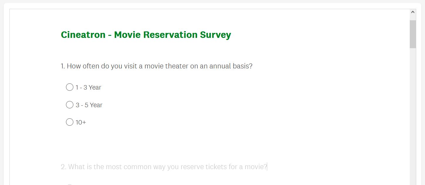
To get some basic information about users theater experiences. I created a survey asking 10 questions to learn more about people going to the theaters and the positive and negative aspects of their typical experience.
User Interviews
Additionally I also conducted a few in person interviews. In which I asked them to walk me though their thought process when deciding and preparing to go to the movies. The goal here was to better understand what a user is thinking when deciding on going to a movie and the steps involved in doing so.
User Research: Pain Points
Personas
Journey Map
Mapping out users journey helped to find areas where a mobile reservation app would be helpful.

Big Picture Storyboard
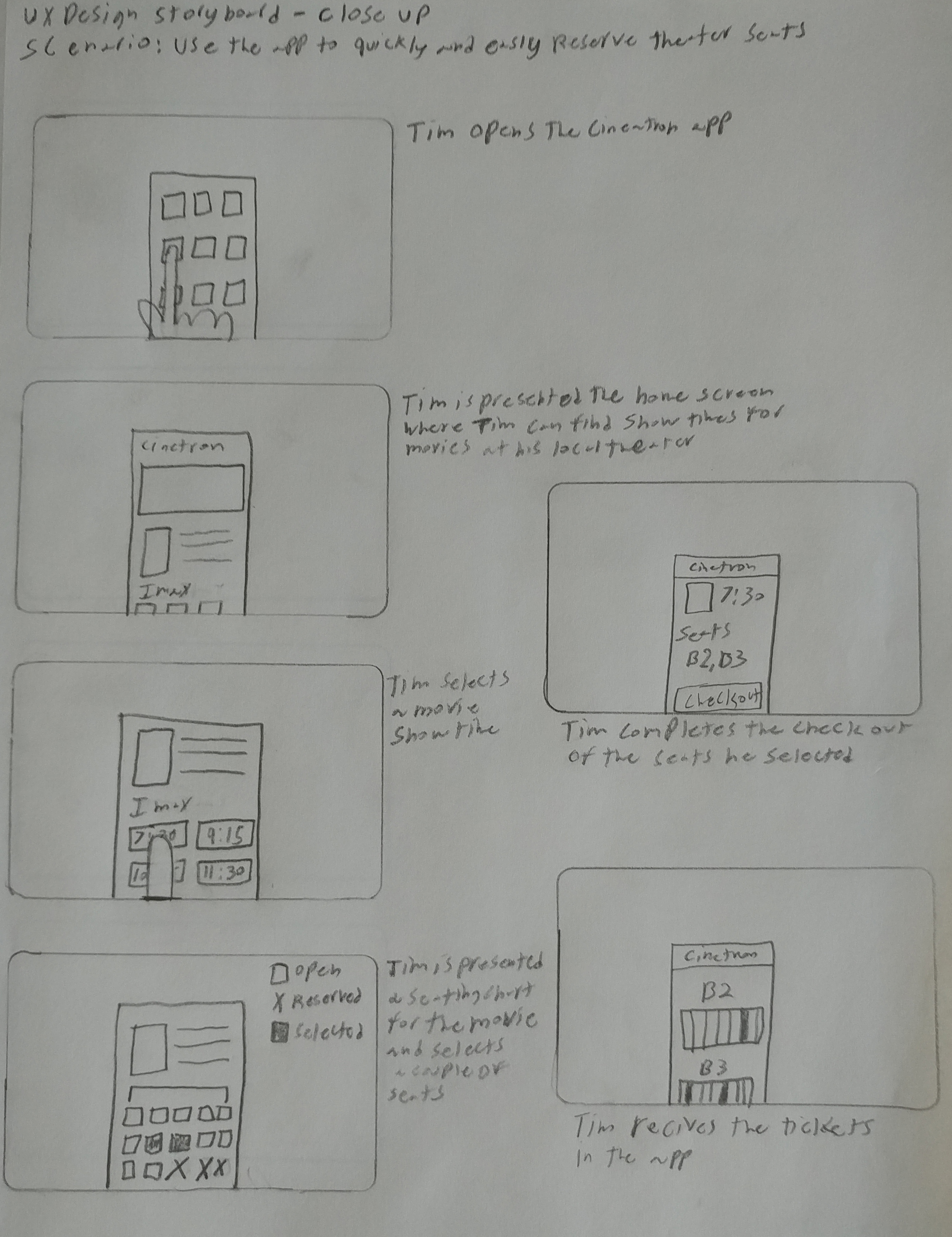
This is an overview storyboard of a user journey to quickly reserving seats for a movie through the app
Design
Starting out the design phases I worked on creating basic ideas though sketching out basic components and wireframes.
Paper Wireframes
Taking the time to draft iterations of each screen of the app on paper ensured that the elements that made it to digital wireframes would be well-suited to address user pain points.
User Flow
Mapping out users journey helped to find areas where a mobile reservation app would be helpful.

Digital Wireframes
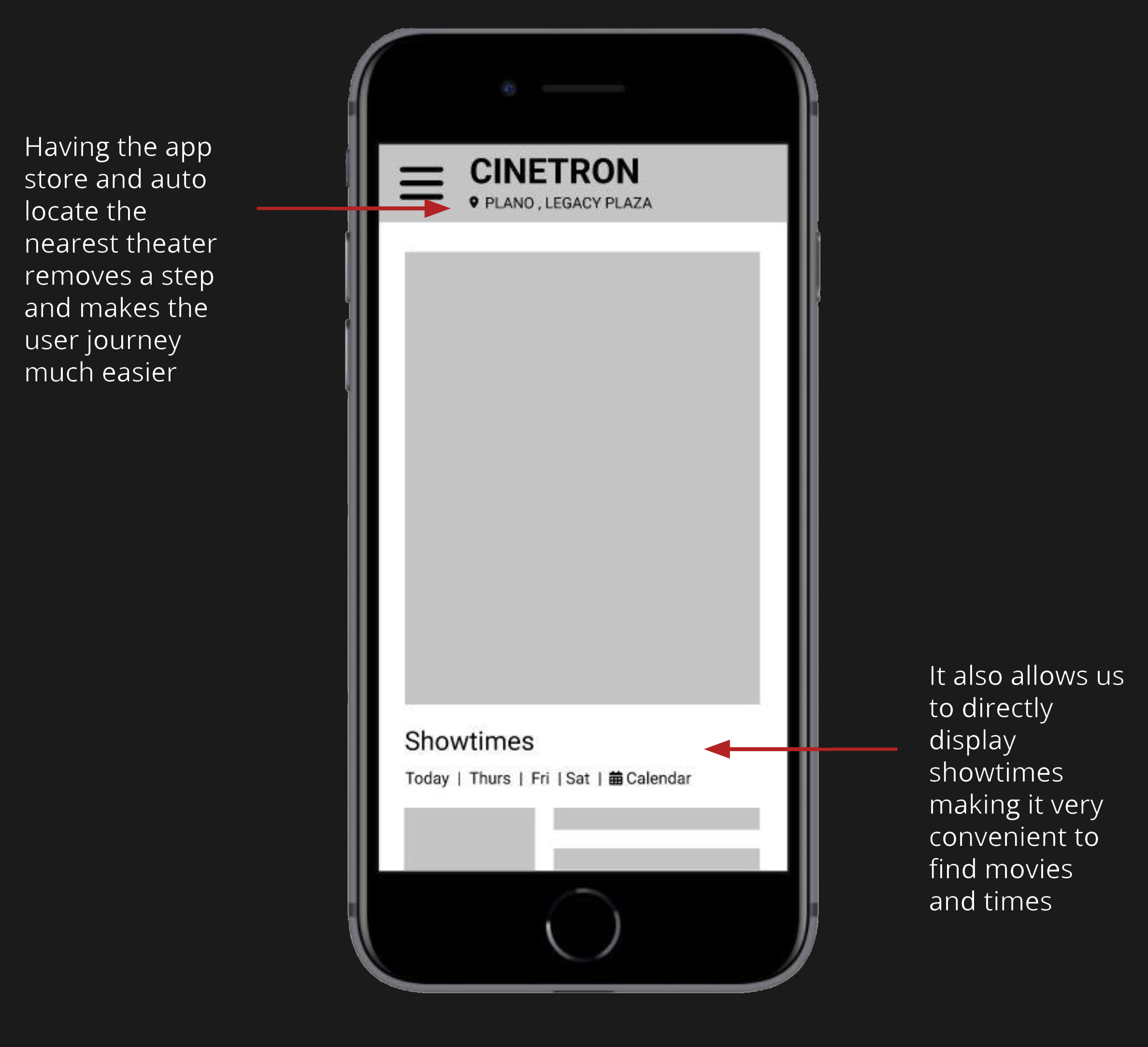
As the initial design phase continued, I made sure to base screen designs on feedback and findings from the user research. In this screen I show how I automated a step in the user process to create a better experience.
Digital Wireframes
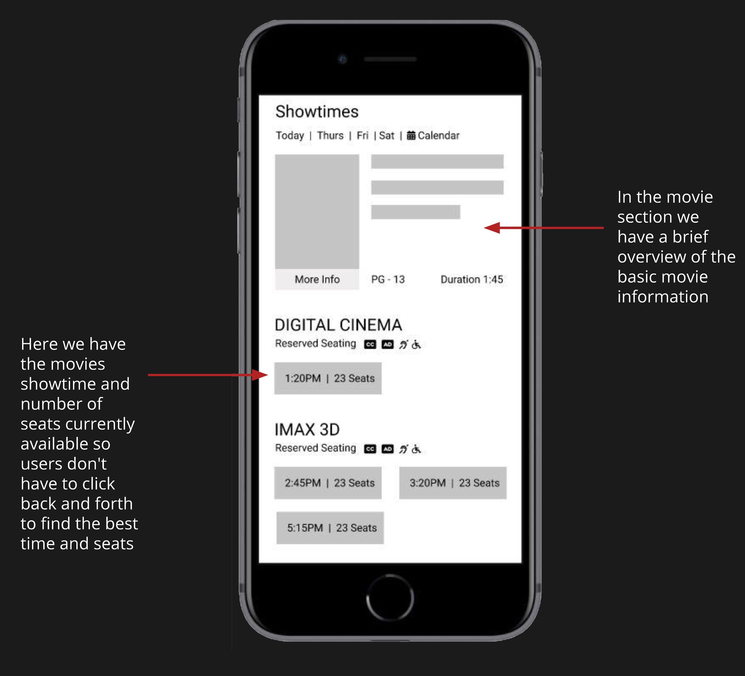
Simple overview was created so that users could quickly find all the information needed to select a movie and showtime.
Low Fidelity Prototype
Using the completed set of digital wireframes, I created a low-fidelity prototype.

Usability study: findings
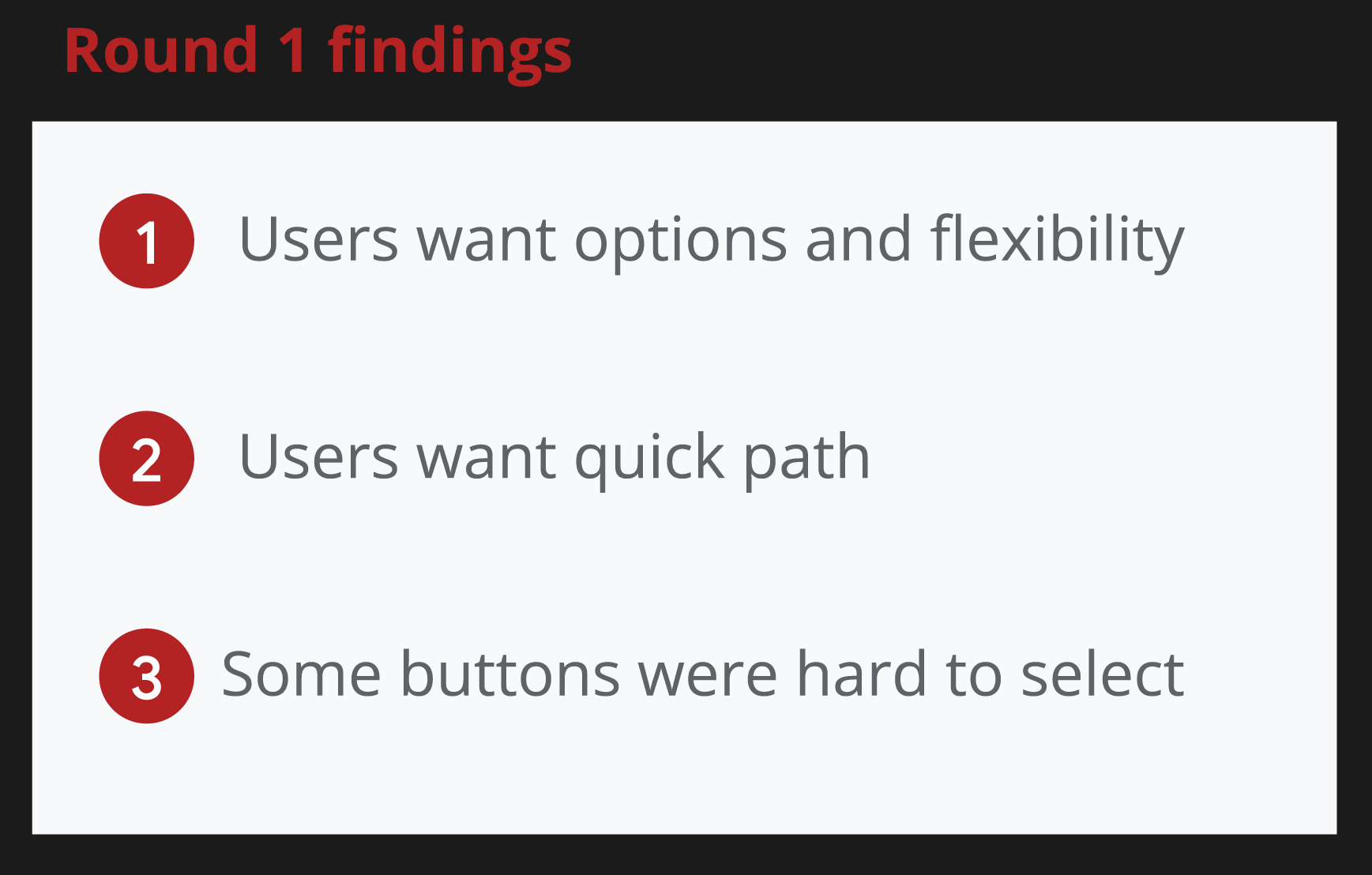
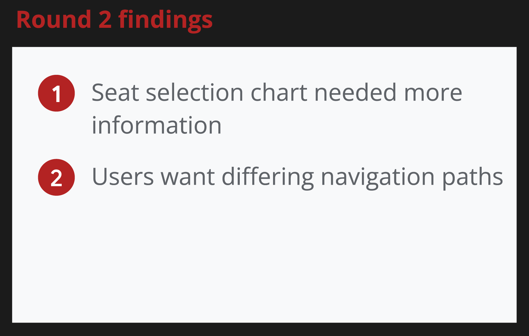
After creating the low-fidelity wireframes I conducted a few rounds of usability studies. Findings from the first study helped guide the designs from wireframes to mockups. The second study used a high-fidelity prototype and revealed what aspects of the mockups needed refining.
Mockups
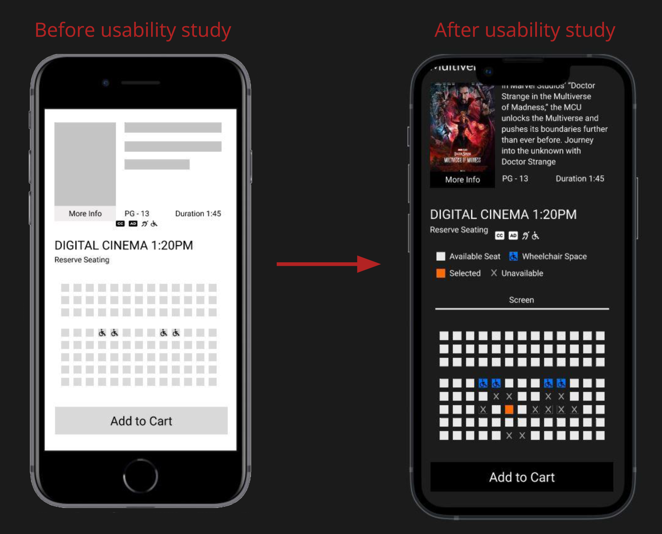
Early designs had a simple seating design, I created a more detailed chart giving users more information and clarity.
Mockups
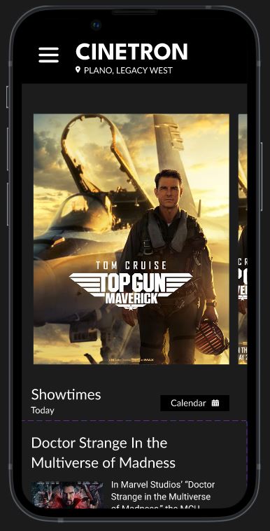
The showtime day and calendar buttons here were hard to use and select because of their size and proximity.

High Fidelity Prototype
Cinetron Prototype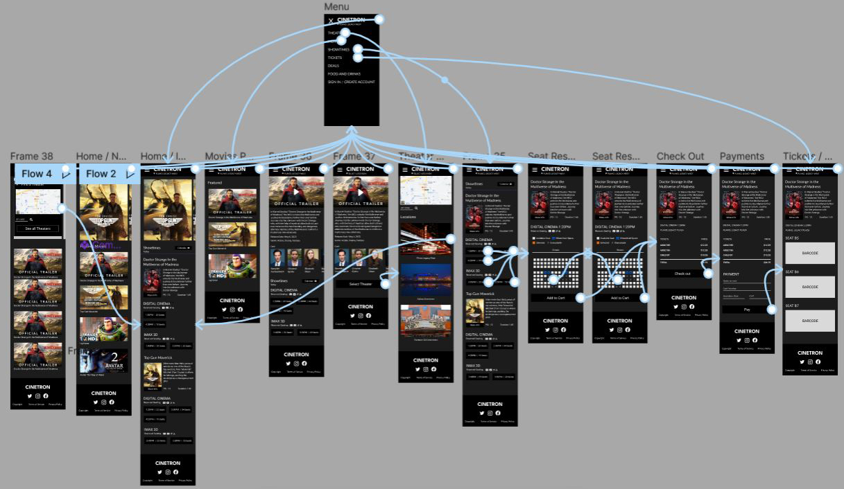
Next Steps
Thank you
Thank you for your time reviewing my work on the Cinetron app! Check out some of my other projects in the links bellow.
